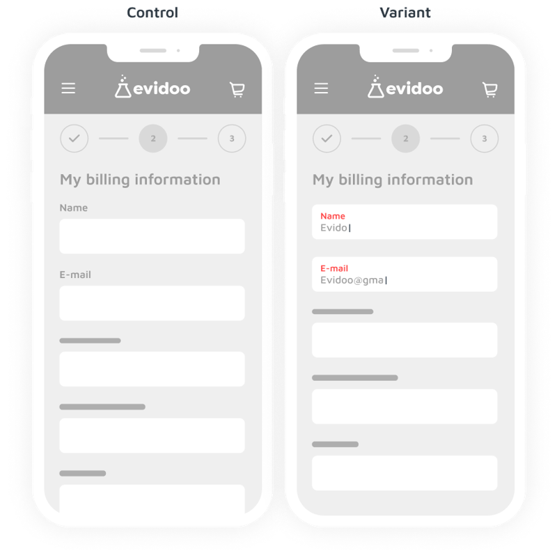
170 | Change normal labels in floating labels | Mobile

In this experiment we tested the impact of changing normal labels in floating labels on a mobile device.
Background
1 of the UX best practices that emerged in 2014 are so-called 'floating labels' in web forms. These are labels that move within an input field. When a field is not yet filled in, the label is displayed within that input field. Once the user starts typing, the label moves to a smaller size above the input field.
This hypothesis is grounded in the following psychological principles:
- Motivation: Increased motivation can be realized when something is esthetically pleasing. Floating labels have a modern, clean look, which can contribute to the overall aesthetics of the webshop.
- Ability: The clarity with which an action can be performed directly influences the likelihood of that action being taken. Floating labels have clarity during entry: even after the user has started entering data, the label remains visible. This minimises the chance of a user forgetting which information should be entered in which field. Floating labels may have fewer errors: because the label always remains visible, the likelihood of errors is reduced.
Based on this theoretical background, we believe that changing normal labels in floating labels for mobile users will cause an increase in online transactions. We will know this when we see online transactions increase.
The primary learning is that the implementation of floating labels in place of standard labels on mobile forms does not necessarily lead to an increase in transactions. In this case, it may have caused confusion or difficulty for users, leading to a decrease in conversion rates.
These could be possible explanations:
- For some users, especially those unfamiliar with this design pattern, floating labels can be confusing at first
- Less space for input: in some cases, the design of floating labels can limit the space available for text content, especially on mobile devices
- Placeholders can cause confusion. Users may recognise placeholders as a hint and not a label.
- Users may skip the field assuming it is already filled in. Upon submission, they see an error that needs to be fixed. This is frustrating and time-consuming.
We did not find remarkable differences between specific segments, for example in the age of users.
All A/B tests in Evidoo have been analysed using Bayesian Statistics. The most important advantage of Bayesian statistics is that it is easy to understand. If there is a difference between the control and the variant, we determine the probability that there is a difference. The probability that the variation differs from the control, is indicated in a percentage.
An A/B test labeled as ">80%" (winner), indicates that the hypothesis has a high probability (>80%) of being true.
An A/B test labeled as "21 - 79%" (inconclusive), suggests the hypothesis has an intermediate chance of being true. This probability range indicates that there is still uncertainty regarding the hypothesis. Therefore it can not be clearly categorized as true or false.
An A/B test labeled as "< 20%" (loser), likely represents a hypothesis that has less than a 20% chance of being true. This suggests that the hypothesis is likely false.
If the primairy KPI is ‘transactions’, there is no impact on average order value, unless mentioned in the learnings.
All A/B tests in Evidoo are also analysed on secondary KPIs, for example 'add to carts'. If we found remarkable results on other KPI’s, check the tab 'learnings'. We also analysed different segments, for example 'new visitors' or 'returning visitors'. If we found remarkable results on specific segments, check also the tab 'learnings'.
All conducted A/B tests in Evidoo comply with:
- conducting sample size and power checks.
- performing the experiment only after an A/A test has been completed.
- implementing Sample Ratio Mismatch (SRM) checks.
- maintaining a minimum runtime of 2 weeks.
- measuring A/B tests only when they are visible to the website visitor, such as counting an A/B test in the middle of the product page only if the visitor has scrolled to that point.